Introduction

Not long ago, I found myself
![]() working on a data project where I needed to analyze patterns from sales data. It got me thinking about how to break down data analysis in a way that could reveal insights without overwhelming me. That’s when I realized the importance of analyzing data through different lenses—univariate, bivariate, and multivariate. These methods not only made my analysis easier but also helped me uncover trends that were otherwise hidden. Let me share with you what I’ve learned along the way.
working on a data project where I needed to analyze patterns from sales data. It got me thinking about how to break down data analysis in a way that could reveal insights without overwhelming me. That’s when I realized the importance of analyzing data through different lenses—univariate, bivariate, and multivariate. These methods not only made my analysis easier but also helped me uncover trends that were otherwise hidden. Let me share with you what I’ve learned along the way.
Univariate Analysis
Univariate analysis is the simplest form of data analysis, where you're looking at a single variable at a time. I remember once analyzing customer order data for an e-commerce business I worked with. I needed to understand the typical order size. I could easily calculate averages, but univariate analysis went deeper than that, helping me find patterns in the data such as how spread out those orders were and whether there were any unusually large or small orders that stood out.
Common Methods:
- Frequency Distribution:
I used this to see how often customers placed orders of different sizes. For instance, how many times did customers order between $50 and $100?
- Measures of Central Tendency:
The mean gave me the average order size, while the mode showed me the most common order value—super helpful when setting promotional pricing.
- Measures of Dispersion:
I could quickly spot whether most customers were ordering similar amounts or whether there were big variations by looking at standard deviation.
Personal Experience with Univariate Analysis:
One time, I was curious about the spending habits of customers in a retail store. Using univariate analysis, I calculated the average amount spent per visit. It was eye-opening because not only did I learn the average, but I also discovered that most customers tended to spend either very little or quite a lot—there wasn’t much middle ground. That insight led me to suggest targeted offers for high-value customers, boosting overall sales.
Benefits of Univariate Analysis:
- It quickly shows you patterns or trends within a single variable.
- It’s a great first step in data exploration and helps spot anomalies early.
- You can easily understand the spread or range of your data.
Visualizations:
- Histograms:
I used this when I wanted to see how customer spending was distributed.
df['order_size'].hist(bins=10)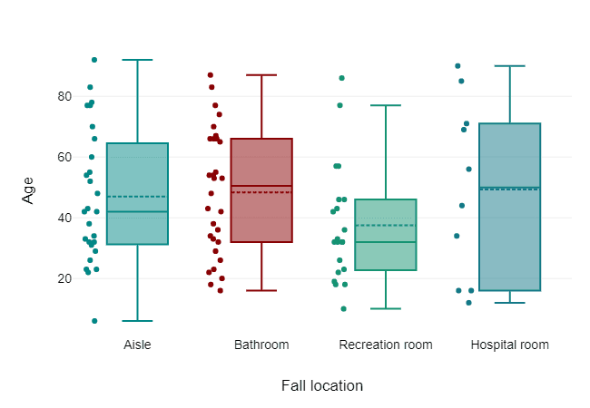
df.boxplot(column='order_size')Bivariate Analysis
Things start to get interesting with bivariate analysis, where you look at two variables together. During one project, I was analyzing a dataset for a car dealership and I wondered: how does the mileage of a car affect its price? By comparing those two variables, I could see a clear negative relationship—the more miles a car had, the lower the price. This kind of insight helped the dealership set better pricing strategies.
Common Methods:
- Correlation: Whenever I wanted to check how strongly two variables were related, I used correlation. Like that time I needed to see if higher advertising spending led to higher sales.
- Scatter Plot: I used this visual when I wanted to actually see how two variables, like car price and mileage, moved together.
- Line Plot: When I was working with time-series data, like sales numbers over months, a line plot was perfect to track trends.
- Bar Chart: I often used these when comparing categories, like the average number of sales per region.
Personal Experience with Bivariate Analysis:
Once, I was working with a real estate agency that wanted to know how the size of a house and its distance from the city center affected its price. By analyzing these two variables together, I discovered that while larger homes were more expensive, the distance from the city had an even bigger effect on price. This insight helped the agency focus its marketing on homes closer to the city.
Benefits of Bivariate Analysis:
- It reveals relationships between two variables that you might not notice otherwise.
- It helps in identifying trends or correlations (e.g., does an increase in one variable cause an increase or decrease in another?).
- It aids in making better business decisions, like which factors influence sales the most.
Visualizations:
- Scatter Plot:
I used this a lot to visualize relationships between two variables like customer age and spending.
df.plot(kind='scatter', x='age', y='spending')
df.plot(kind='line', x='month', y='sales')
df.groupby('product_category')['sales'].mean().plot(kind='bar')Multivariate Analysis
When I started working with multiple variables, I stepped into multivariate analysis. I remember trying to figure out how different factors—like the number of bedrooms, the location, and the price—worked together to affect a home’s sale price. That was the first time I truly appreciated how valuable multivariate analysis could be. It’s like finding hidden layers in your data that you wouldn’t catch by just looking at two variables.
Common Methods:
- Multiple Regression: I used this when I wanted to model how several variables together affected an outcome, like how age, income, and education level predicted spending habits.
- Pearson Correlation Matrix: This helped me see how different variables correlated with one another at a glance.
- Bar Plot with Legend: It’s perfect when you want to compare multiple groups on the same plot using different colors to show each category.
Personal Experience with Multivariate Analysis:
One of the most useful experiences I had with multivariate analysis was during a marketing project. I was helping a company figure out which combination of advertising channels (social media, email, and paid ads) and customer demographics (age, gender) were driving the most sales. By analyzing all these factors together, we discovered that social media ads were most effective for younger customers, while older customers responded better to emails. This led to a complete revamp of their marketing strategy.
Benefits of Multivariate Analysis:
- It helps you understand how multiple variables interact with each other.
- It’s essential for predictive modeling, where you want to forecast an outcome based on multiple factors.
- It provides deeper insights into complex relationships in the data.
- It allows for more informed and strategic decision-making by considering all relevant variables at once.
Visualizations:
- Pair Plot:
I loved using this to see the relationships between all variables in one plot.
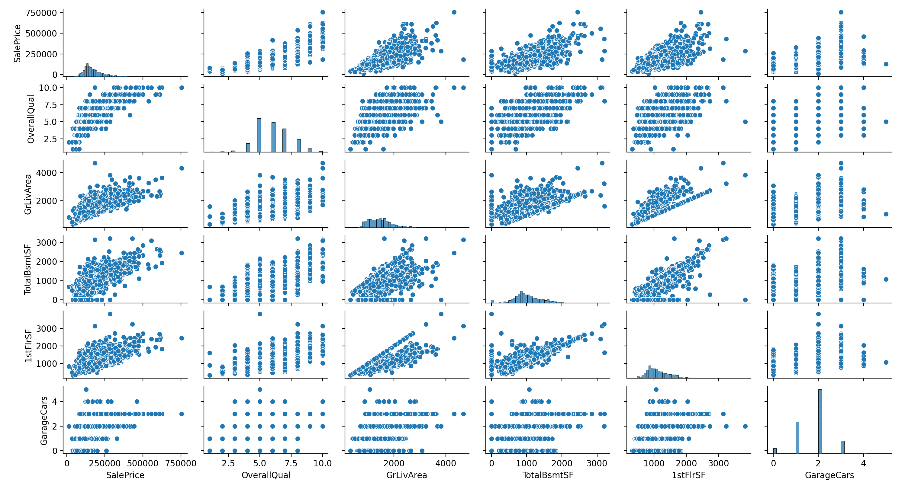
import seaborn as sns
sns.pairplot(df)
sns.heatmap(df.corr(), annot=True)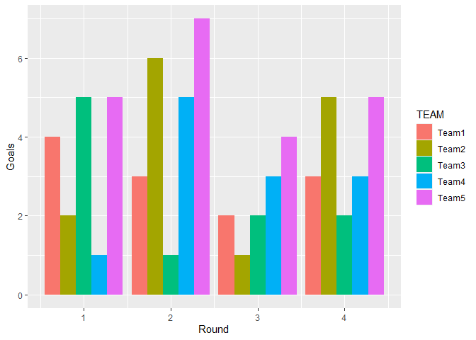
df.pivot_table(index='category', columns='region', values='sales').plot(kind='bar')Conclusion
Looking back on my experiences with univariate, bivariate, and multivariate analyses, I can confidently say that these techniques have been game-changers in how I approach data. What started as simply looking at numbers has turned into uncovering stories hidden within the data. Whether it’s understanding a single variable’s distribution, exploring relationships between two variables, or discovering intricate patterns with multiple variables, each method has its place and power.
For me, it’s all about asking the right questions: What does this data mean? How are these factors connected? And how can I use this insight to make better decisions? Whether I was working with marketing data, real estate prices, or customer behavior, these techniques consistently helped me find actionable insights that would have otherwise gone unnoticed.
At the end of the day, analyzing data is like peeling back layers of an onion—each layer reveals something new, and together, they create a complete picture. So, whether you're just starting out with simple analyses or diving into more complex multivariate techniques, remember that each step brings you closer to understanding your data better and making smarter decisions.
Comments
Post a Comment