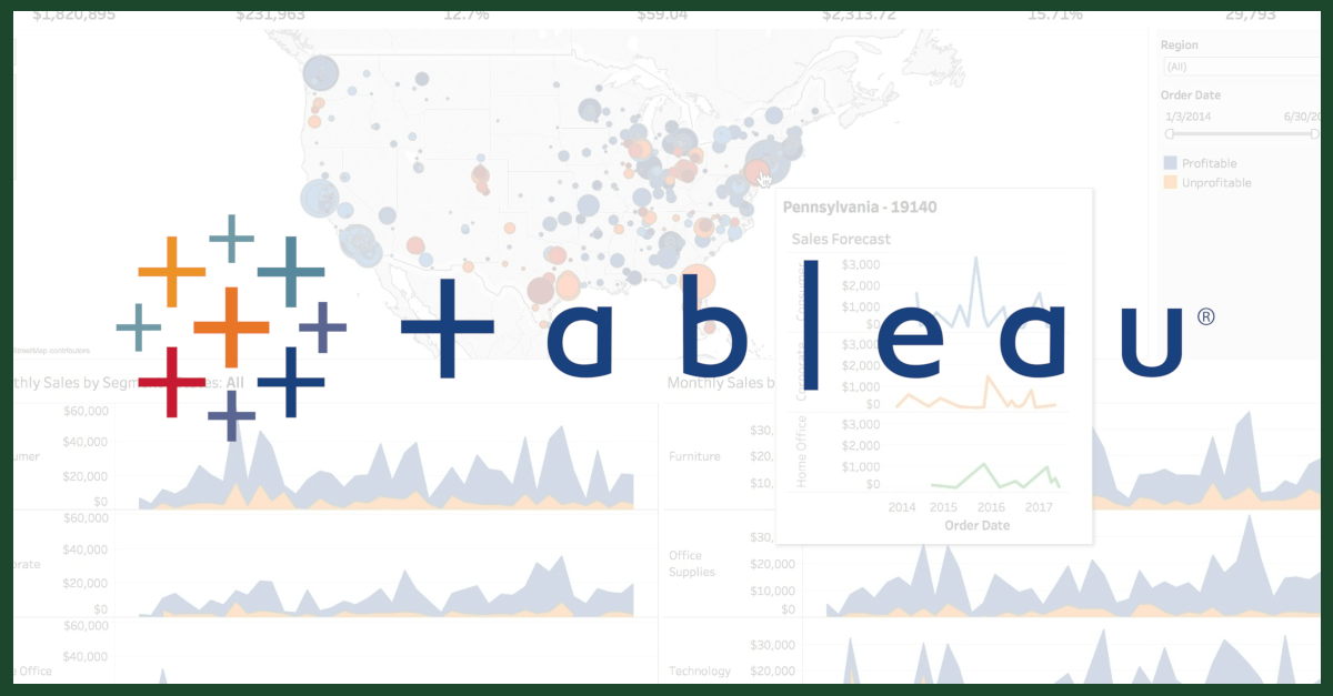
When I first started working with data, I came across several tools, but one that really stood out to me for its unique features and user-friendly interface was Tableau. Over the years, I’ve found that Tableau excels
![]() a few key areas that make it a go-to choice for certain types of data visualization projects. If you want to quickly turn raw data into something visually impactful and interactive, Tableau is the perfect tool.
a few key areas that make it a go-to choice for certain types of data visualization projects. If you want to quickly turn raw data into something visually impactful and interactive, Tableau is the perfect tool.
My Experience with Tableau
I still remember the first time I created a dashboard in Tableau. It was a project focused on visualizing birdstrike data. This dataset involved incidents of birds colliding with aircraft, and the goal was to identify trends over time, locations most prone to birdstrikes, and potential preventive measures. The sheer flexibility and intuitiveness of Tableau allowed me to transform the data into a dashboard that provided instant insights to the aviation authority I was working with. The ability to create interactive maps and drill down into specific locations with just a few clicks made all the difference.
Why Tableau Stands Out

There’s no shortage of data visualization tools out there, but Tableau stands out for a few key reasons:
- Drag-and-Drop Interface: One of the best parts about Tableau is how quickly you can build something from scratch. You don’t need to be a technical expert to create complex visualizations. Its intuitive drag-and-drop interface allows users to easily create dashboards without any coding experience.
- Advanced Data Blending: In one of my projects, I needed to combine data from several different sources, including CSV files and SQL databases. Tableau’s ability to blend data on the fly, without having to write complex SQL queries, allowed me to create unified views from disparate sources effortlessly.
- Data Storytelling: Tableau enables me to tell stories with data through its interactive dashboards. For example, in my IMDB Movies Rating Dashboard, I could take users through the journey of how movie ratings have evolved over time, allowing them to filter by genre, director, or release year to explore trends. It felt more like guiding someone through a narrative than presenting numbers.
- Real-Time Data Integration: One thing I’ve always loved about Tableau is its ability to integrate real-time data. In my Crop Farming Dashboard, I was able to incorporate real-time data from weather stations and crop yield sensors. This gave farmers instant feedback on how weather changes were impacting their crops, enabling faster, more informed decision-making.
- High-End Visuals and Aesthetic Control: Unlike many tools, Tableau offers a fine level of control over the aesthetics of the visualizations. It allowed me to craft dashboards that not only looked professional but also visually aligned with the branding of the company I was working with.
- Tableau Public and Community: Tableau has an incredible public platform where I can publish dashboards and get feedback from the community. When I created my Customer Churn Dashboard, which predicted customer drop-offs based on trends and behaviors, sharing it on Tableau Public gave me valuable insights from fellow analysts who had worked on similar projects.
Real-World Projects I’ve Built with Tableau
Tableau has enabled me to work on some really interesting projects across industries. Here are a few of my favorites:
1. Birdstrike Dashboard
This dashboard helped aviation authorities analyze birdstrike incidents around the world. I used Tableau’s map functionality to plot birdstrike locations and identify hotspots near airports. By filtering the data by year and aircraft type, I could provide actionable insights that helped in crafting prevention strategies. The interactive nature of Tableau allowed the aviation team to zoom in and analyze data in real-time, a feature that’s unique to Tableau’s dashboarding.
2. Crop Farming Dashboard
For an agricultural project, I built a Tableau dashboard that helped farmers monitor their crop yields based on weather patterns. I integrated data from multiple sources like weather stations and yield sensors. The dashboard provided real-time updates on crop health, rainfall, and temperature, all in one place. Tableau’s ability to work with large datasets seamlessly made this project much smoother and quicker than expected.
3. IMDB Movies Rating Dashboard
This dashboard was one of the most fun projects I’ve worked on. I analyzed movies and their ratings from IMDB, helping movie studios understand what genres were trending, which directors were consistently rated higher, and how movie ratings changed over time. By using Tableau’s date filters, users could navigate through decades of data effortlessly. The dashboard was shared publicly, and many users found the visual storytelling particularly engaging.
4. Customer Churn Dashboard
This dashboard was designed for a subscription-based business that wanted to predict customer churn. Tableau’s advanced data blending and filtering capabilities allowed me to merge customer transaction data with engagement metrics and behavioral patterns. The result was an interactive dashboard that could forecast potential churn based on historical trends and current behaviors, helping the company take preemptive actions to retain their customers.
Visualizations that Shine in Tableau
Tableau offers a range of visualization options, but there are a few that I’ve found particularly powerful:
- Heat Maps: In my Birdstrike Dashboard, I used heat maps to highlight areas with high birdstrike incidents. It was instantly clear where the problem zones were.
- Scatter Plots: Scatter plots were incredibly useful in my Customer Churn Dashboard. By plotting customer spend versus engagement, we could see clear clusters of high-risk customers.
- Tree Maps: In my Crop Farming Dashboard, I used tree maps to show the distribution of crop types across different regions. It provided an instant visual of which crops were dominating in which areas.
- Bar Charts: For my IMDB Movies Rating Dashboard, bar charts were perfect for comparing directors, actors, or genres across time periods.
- Geospatial Maps: Tableau’s geospatial capabilities are unmatched, and I frequently use maps to plot data that’s location-based. For instance, plotting customer locations and sales regions in my retail projects provided immediate geographic insights.
Advantages of Tableau
While there are other data visualization tools, Tableau stands out due to these unique advantages:
- Interactive Filters: Tableau’s ability to add filters that users can interact with is a game-changer. You can drill down into data by simply clicking on visual elements or using slicers to fine-tune what you see in real-time.
- Performance with Large Datasets: Tableau handles large datasets very efficiently. Whether I was working with millions of rows of agricultural data or customer transactions, Tableau kept things running smoothly.
- Rich Visual Options: Tableau provides more sophisticated visual customization options than many other tools, allowing me to create beautiful, branded dashboards for clients.
- Seamless Data Blending: One of the features I’ve relied on heavily is Tableau’s ability to blend data from different sources without writing SQL. It’s perfect when dealing with multiple datasets that need to be analyzed together in real time.
- Storytelling Power: With Tableau, I can craft interactive data stories. The IMDB dashboard was a great example where users could explore movie ratings over time and discover trends by genre, director, and actor, providing a deeper level of engagement with the data.
Conclusion
From my experience, Tableau is the ideal tool for building dashboards that not only present data but also invite users to interact with it. Whether it's visualizing real-time data for farmers, helping businesses predict customer churn, or telling the story of movie ratings through time, Tableau offers unmatched flexibility and power. What really sets it apart is the ability to turn raw, often complex data into something that’s easy to understand and actionable.
For anyone looking to turn their data into insights, I would highly recommend exploring Tableau. It’s more than just a visualization tool—it’s a platform that helps you see and understand your data like never before.
Comments
Post a Comment